Monospaced Fonts For Your Startup, Coding & Design Projects

Hi there! We recently launched the pre-order for our start-up, Typogram, an easy to use logo design tool for absolute beginners, Check it out!✨ If you want to stay in touch, sign-up for our build-up-public newsletter updates where I share what I'm working on!
We covered monospaced fonts many times in our beloved FontDiscovery newsletter. (See our previous post if you need a quick refresher on the history of monospaced fonts.) Some are a part of an extensive font family, some standing strong on their own. One thing is for sure, people love to monospace fonts because some of these issues are our most popular. Here is a recap of the monospaced issues we have covered so far. You can try these fonts for as coding fonts, fonts for your web, app, or design projects and fonts for your branding and startup.
Noto Sans Mono
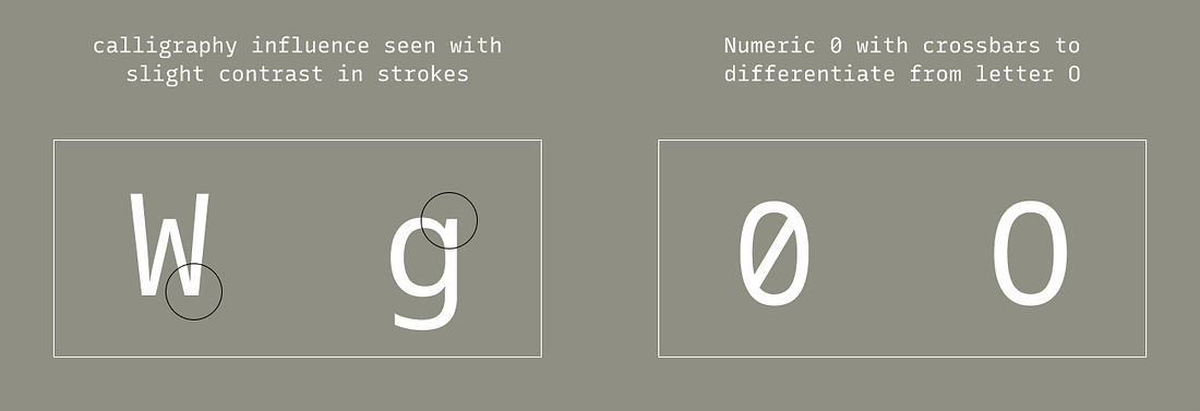
We covered Noto in FontDiscovery issue 42. It is a joint project by several big tech companies (Google, Adobe, and Monotype) to eliminate “Tofu,” which is the box that shows up when there is a missing character. Taking the neutral tone and style elements from the Noto Sans, Noto Sans Mono is neutral and inviting. The monospaced version of Noto Sans is also available. It has several weights and italics for you to use. And you can toggle ligature if you need to.
Details
Humanist sans serif influence (calligraphy)
Numeric “0” with crossbars to differentiate from letter “O”
img: font-details of Noto Mono
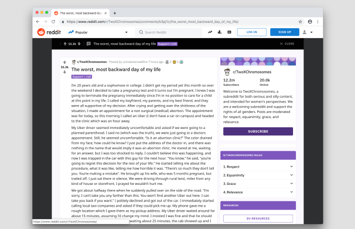
img: Reddit homepage uses IBM Plex Sans for the link titles and most of the interface. The body text of posts is set in Noto Sans. source: FontInUse
IBM Plex Mono
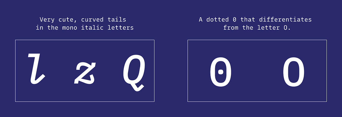
Like Noto Sans Mono, IBM Plex Mono (issue 13) benefits from being in a large font family: it has several weights and italics. Plex is extensive because IBM originally used it as its branding font. IBM wanted to illustrate the themes of humanity and machine. The font mirrored this brand vision by having neutral and balanced weights with more friendly italics. Compared with Noto Sans Mono, IBM Plex Mono feels more “rigid” with serifs on the letters.
Details
Curved tails in “l,” “z,” and “Q” for monospace italic
Dotted numeric “0” to differentiate from the letter “O”
img: type details of Plex Mono.
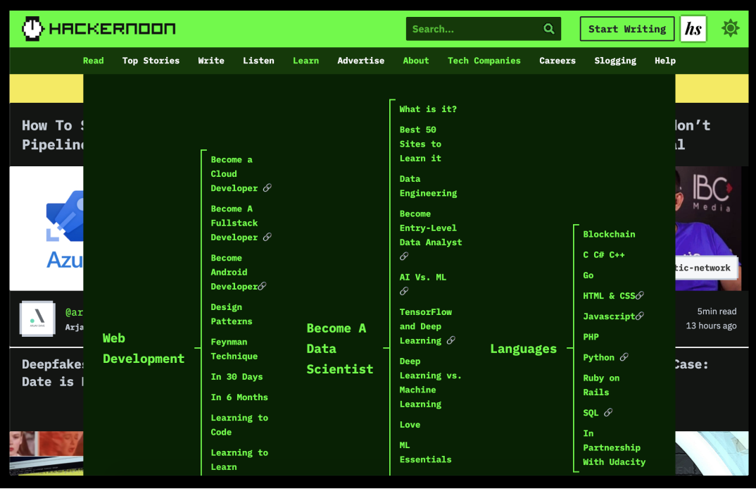
img: hackernoon uses are Plex for its site. The UI texts are Plex Mono. the article is Plex Sans. source: hackernoon
Xanh Mono
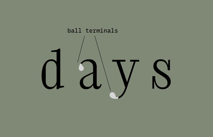
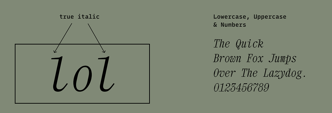
Xanh Mono (issue 36)is a unique monospaced font. It spices up the idea of monospaced fonts with its pronounced serifs and ball terminals that I haven’t seen in others. It brings an extra sense of elegance and grandeur to designs as a display font for headers. As a coding font, I think it’s an acquired taste. Because of its large serifs, I find Xanh Mono uncomfortable to stare at them for hours when coding. However, if you want to spice up your editor, give it a try.
Details
Transitional serifs with ball terminals
Only one weight with true italic
img: ball terminal on lowercase
img: true italic lowercase letters of Xanh Mono
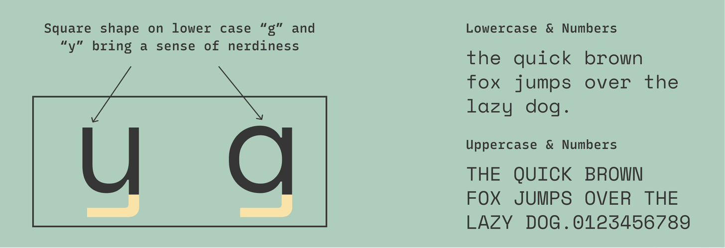
Space Mono
While monospaced fonts sound techy and nerdy, they also appear intimate and friendly in specific contexts. Reasons could be the extra comfort to our eyes brought by its fixed width or remembrance of memories past when we click-clacked our thoughts to our loved ones. Either way, monospaced fonts are having a comeback. People love using them in their brands.
Space Mono (issue 21) is an excellent example of this. It is a cute, eclectic, friendly monospace font combining geometric perfection with the human touch. The shapes of the letters are very geometric but with a funky calligraphic influence of grotesque sans serifs. Human touch like these makes Space Mono perfect for friendly tech brands.
Details
Geometric, almost retro-looking letters with funky calligraphic influence
Dotted numeric “0” to differentiate from “O”
img: font details for space mono.

img: Data display using Space Mono. source: Google Design
If you enjoyed this post, you can also subscribe our FontDiscovery newsletter, where we share weekly tips about font and design.